Free invoicing software is everywhere. Search the web, and you’ll find dozens of tools promising effortless billing and client management—at no cost. But here’s the truth: most of them come with hidden trade-offs. Cluttered interfaces, limited features, confusing layouts, or constant upsell prompts make the experience anything but smooth.
BillingBee, however, has rewritten that story. It proves that “free” doesn’t have to feel cheap. Instead, it can look, feel, and function like a premium product—because design, not pricing, defines quality.
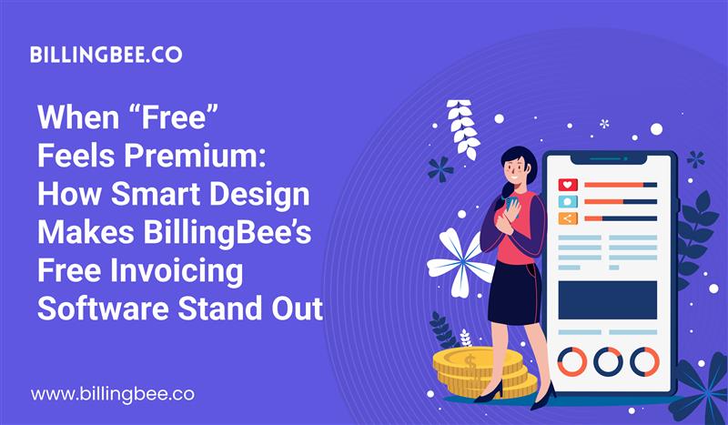
In this article, we’ll explore how BillingBee’s thoughtful design choices turn a simple free invoicing software into a brand experience users love, trust, and recommend.
1. The Power of First Impressions
Open most free invoicing platforms, and you’re greeted with clutter—buttons everywhere, outdated fonts, and layouts that feel like spreadsheets from the early 2000s. BillingBee takes a different route.
Its design philosophy starts with empathy. Every color, button, and element is crafted to make invoicing feel less like a chore and more like progress. The dashboard is clean and inviting, using soft gradients, intuitive icons, and logical navigation.
From the very first login, users feel like they’re in control. That’s not an accident; it’s branding by design.
By blending visual simplicity with smart functionality, BillingBee creates a first impression that says: This isn’t just free. It’s professional.
2. Designed for Humans, Not Just Numbers
Most invoicing tools are built for transactions. BillingBee is built for people.
Its user interface focuses on natural workflows. Whether you’re a freelancer sending your first invoice or a small business owner managing multiple clients, the process feels seamless.
- No complex forms.
- No confusing menus.
- No extra steps that waste time.
Instead, every action feels intuitive. The “Create Invoice” button isn’t buried—it’s exactly where your eyes expect it to be. Currency settings, tax inputs, and payment methods are all neatly structured, helping users focus on what matters most: getting paid on time.
This human-centered approach doesn’t just make the tool easier to use—it builds trust. Users associate ease with professionalism, and that’s how BillingBee turns free users into loyal advocates.
3. Consistency: The Secret Ingredient of Premium Design
One of the key elements that makes BillingBee’s free invoicing software feel premium is consistency. Every visual and functional component follows a unified system—from typography and button sizes to alignment and iconography.
Why does this matter? Because consistency breeds confidence.
When users see predictable layouts and familiar patterns, they instinctively trust the platform more. It feels stable, reliable, and designed with care. That’s the kind of subconscious reassurance that big brands pay millions to create—and BillingBee achieves it naturally through thoughtful design choices.
4. A Brand That Speaks Through Simplicity
BillingBee’s design language isn’t flashy—it’s purposeful. The platform doesn’t overwhelm users with unnecessary options or visual noise. Instead, it focuses on clarity.
The color palette balances professionalism and warmth—inviting without being distracting. Font choices are clean and modern, giving every invoice a polished appearance that reflects the user’s own credibility.
When your clients receive an invoice created with BillingBee, it doesn’t scream “free tool.” It whispers “professional business.”
That’s the power of good branding through design—it elevates perception, even at zero cost.
5. Functionality that Complements Design
A beautiful interface is meaningless without strong functionality behind it. BillingBee understands this balance.
While the design is clean, it’s also deeply practical.
- Generate professional invoices in seconds.
- Automate recurring bills.
- Track payments and client history effortlessly.
- Access everything securely from the cloud.
The platform’s responsive design ensures it looks and performs perfectly across devices—whether on a laptop, tablet, or mobile.
This combination of simplicity, power, and accessibility gives users the sense that they’re using a premium product. The fact that it’s free is simply a bonus.
6. Building Trust Through Transparency
Many “free” invoicing tools trap users with limitations—watermarked invoices, hidden fees, or restricted templates. BillingBee’s philosophy is refreshingly different.
Transparency is built into its experience. Users can explore features without constantly being nudged to upgrade. This openness builds brand trust—a priceless commodity in today’s software market.
When users realize they can manage their invoicing confidently and professionally for free, they become long-term advocates, spreading the word organically.
That’s how good design, paired with honest intent, creates marketing that doesn’t even feel like marketing.
7. Why Design Matters in the World of “Free”
In an era where AI can clone products overnight, design is the ultimate differentiator. It’s not just about how software looks—it’s about how it feels to use.
BillingBee’s free invoicing software stands out because it respects users’ time, intelligence, and experience. It communicates value through every detail:
- A logical layout that reduces cognitive load.
- A visual rhythm that feels calm and confident.
- A tone of voice that is helpful, never pushy.
Design becomes the invisible hand that makes “free” feel premium.
8. Free Doesn’t Mean Basic—It Means Belief
At its core, BillingBee’s design philosophy reflects a belief: every business, no matter how small, deserves tools that look and feel world-class.
By offering a beautifully designed, free invoicing software, BillingBee empowers freelancers, startups, and global entrepreneurs to operate with confidence. It bridges the gap between affordability and excellence—proving that generosity and good design can coexist.
Final Thoughts
BillingBee’’s free plan isn’t just another tool—it’s a statement. A statement that says premium experiences don’t need premium price tags.
When design meets empathy, “free” becomes powerful. BillingBee’s thoughtful approach transforms an everyday utility into a brand experience users are proud to associate with.
Because when “free” feels this good, it doesn’t just attract users—it earns believers.